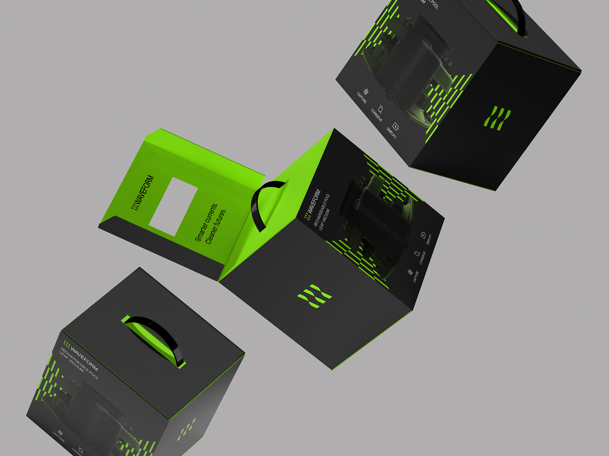
Waveform
Building a pool care brand around smarter engineering, simpler maintenance, and a more considered relationship with water.



OVERVIEW
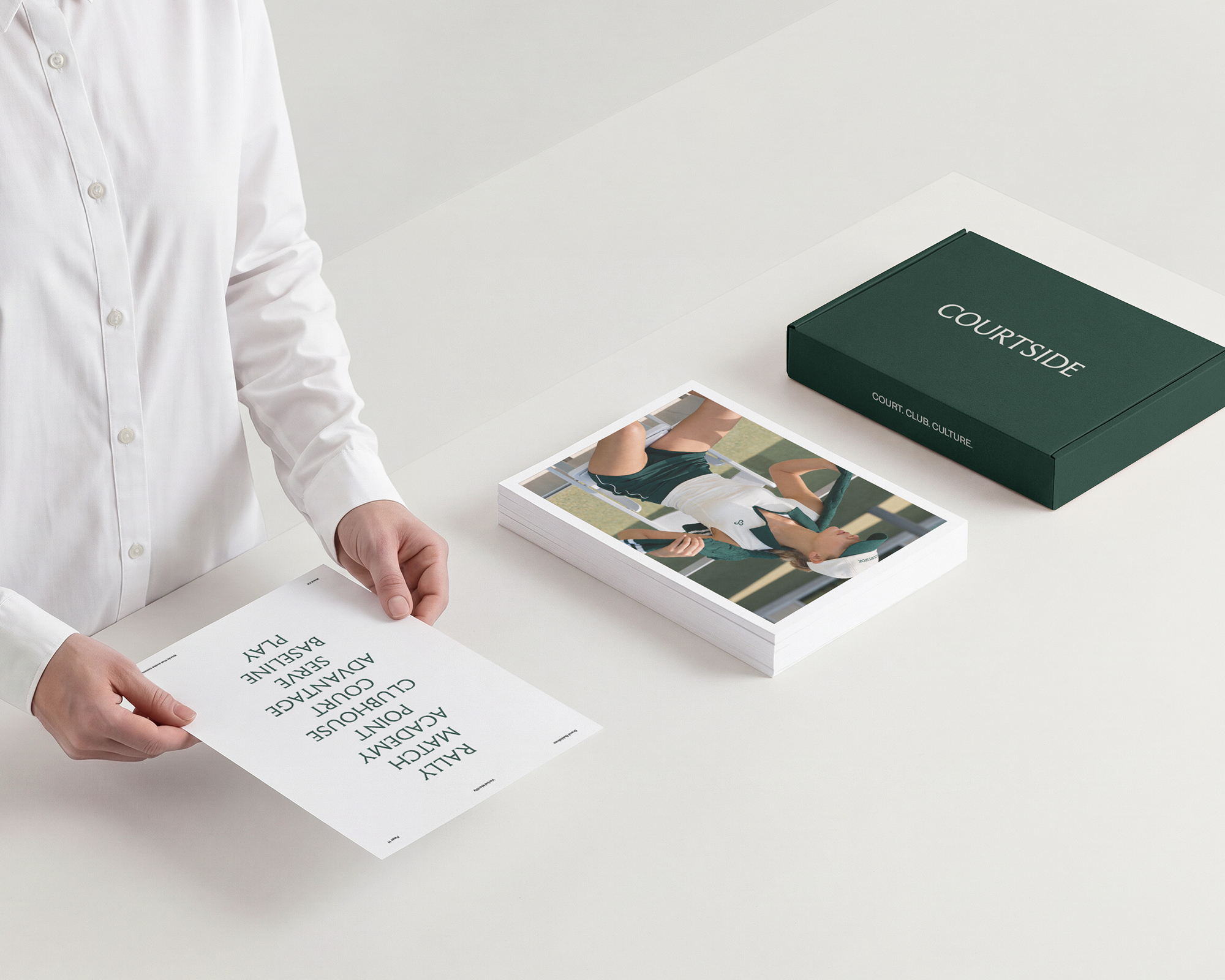
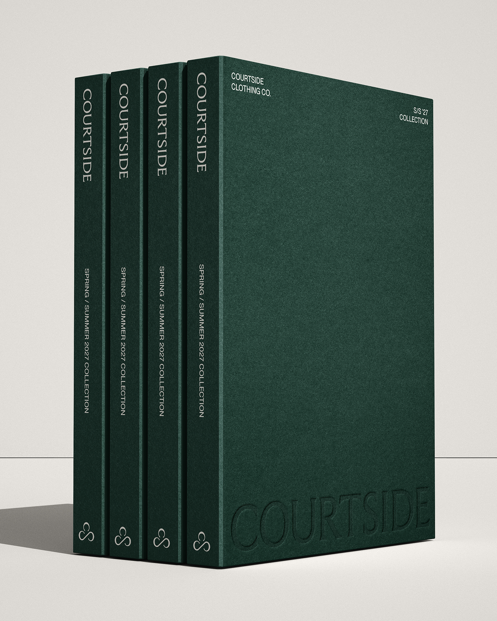
Courtside Clothing Company brings tennis heritage into the rhythm of everyday life. Taking its cue from playing partners, shared traditions, and favorite pieces worn on repeat, the brand connects considered style with the relationships that give the game meaning. We translated that idea into a cohesive strategy, verbal identity, and visual system, balancing sporting character with contemporary refinement to give Courtside a familiar yet distinctive presence, from the court to the company kept afterward.
BRAND STRATEGY & MESSAGING
We positioned Courtside around the enduring connections that give tennis meaning—playing partners, shared traditions, and personal style. “Matches made to last” became the defining idea, supported by “The next set of classics” and “People are the point,” creating a strategy and verbal identity that brings tennis heritage forward through a composed, personable, and quietly playful point of view.
VISUAL IDENTITY & DESIGN SYSTEM
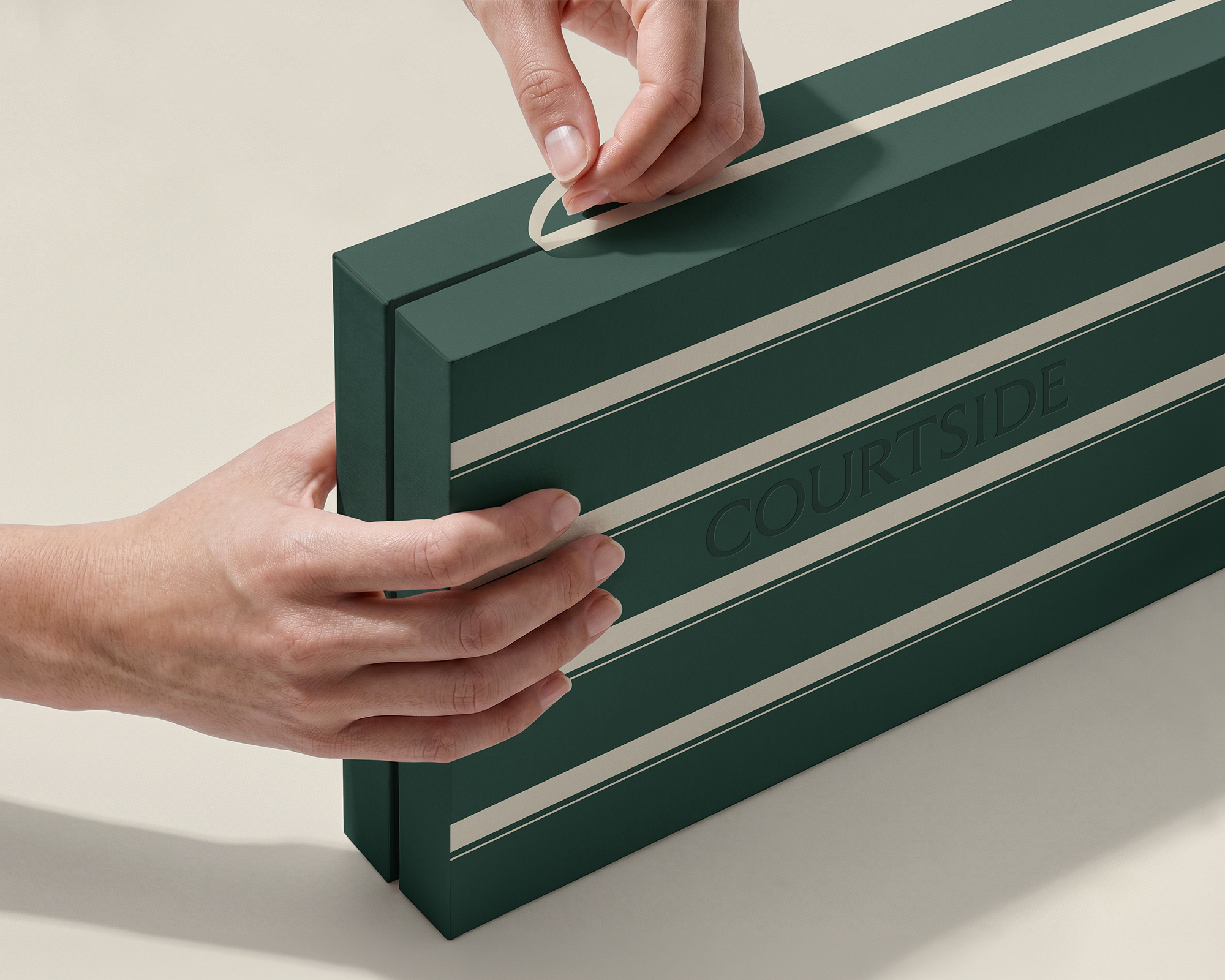
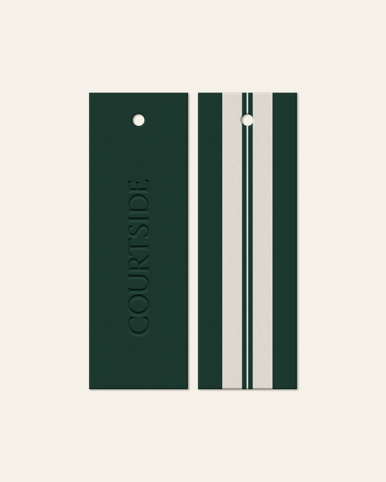
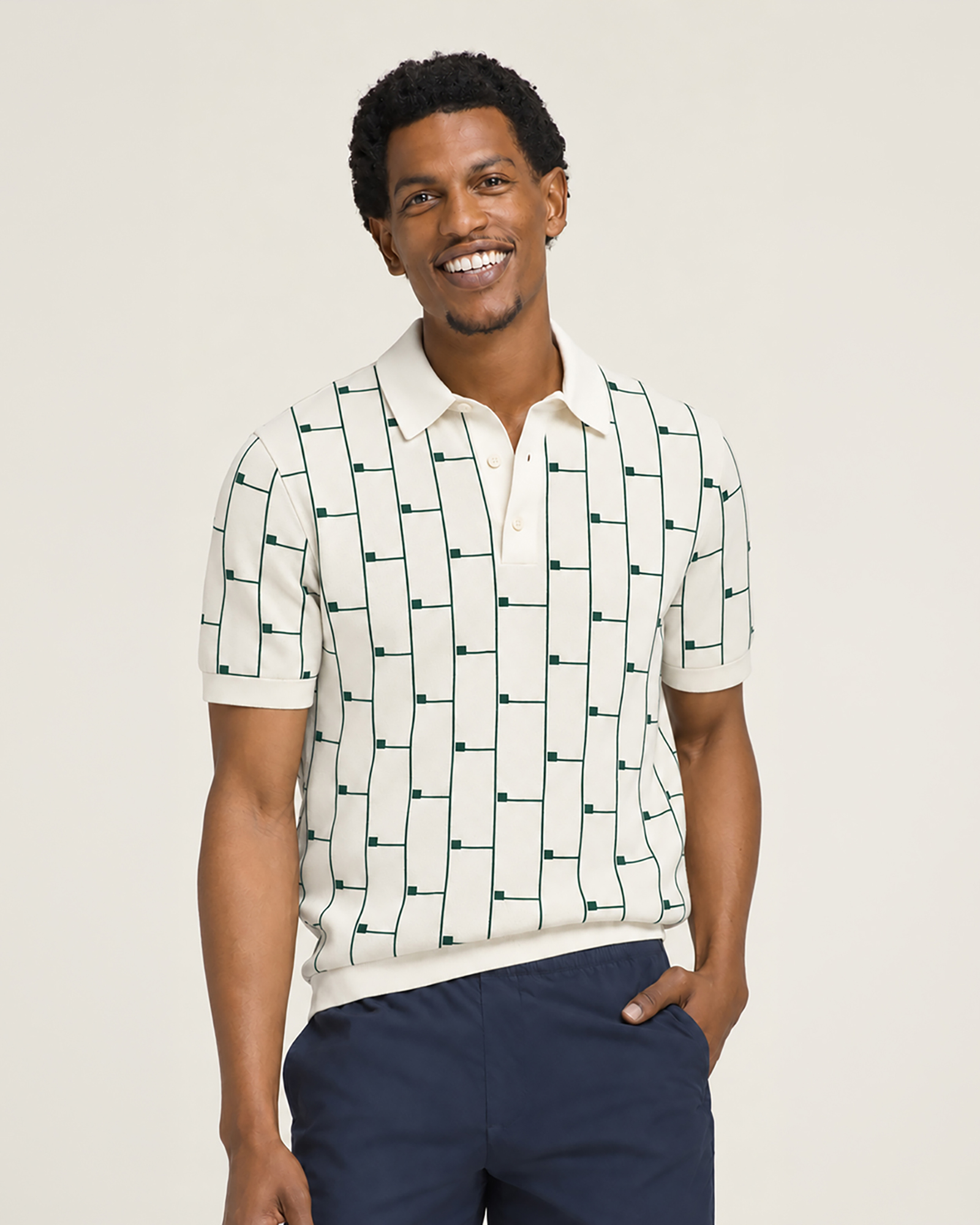
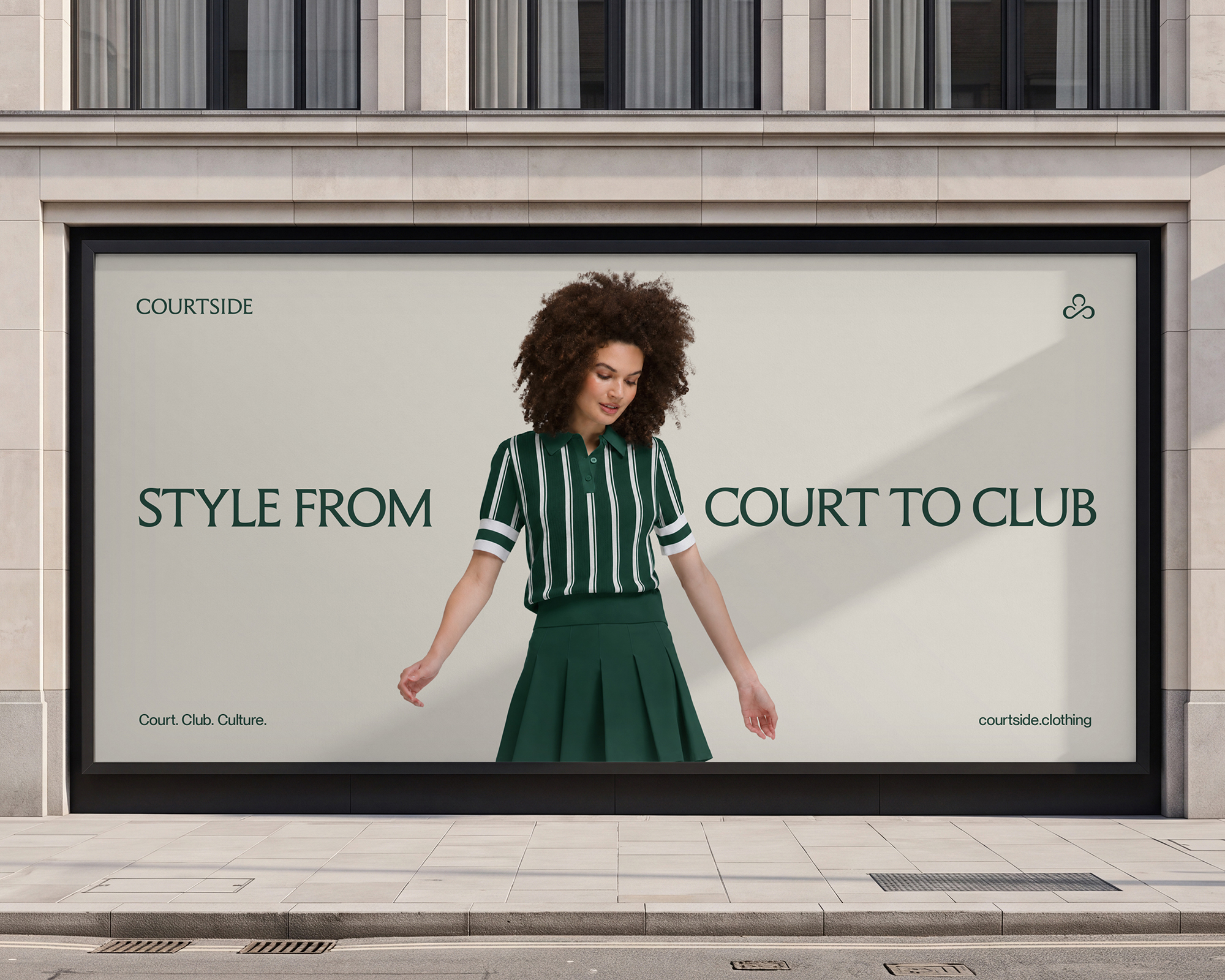
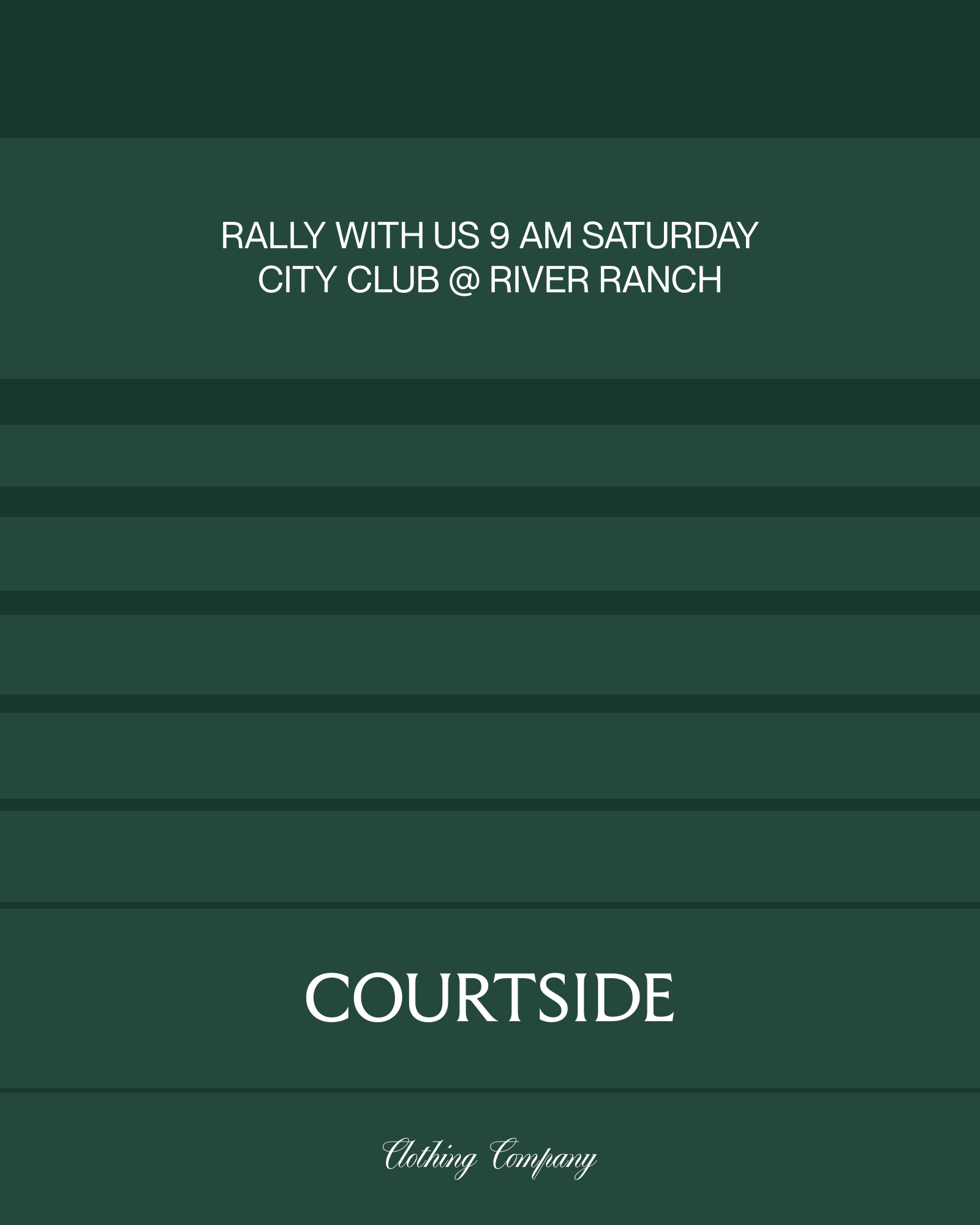
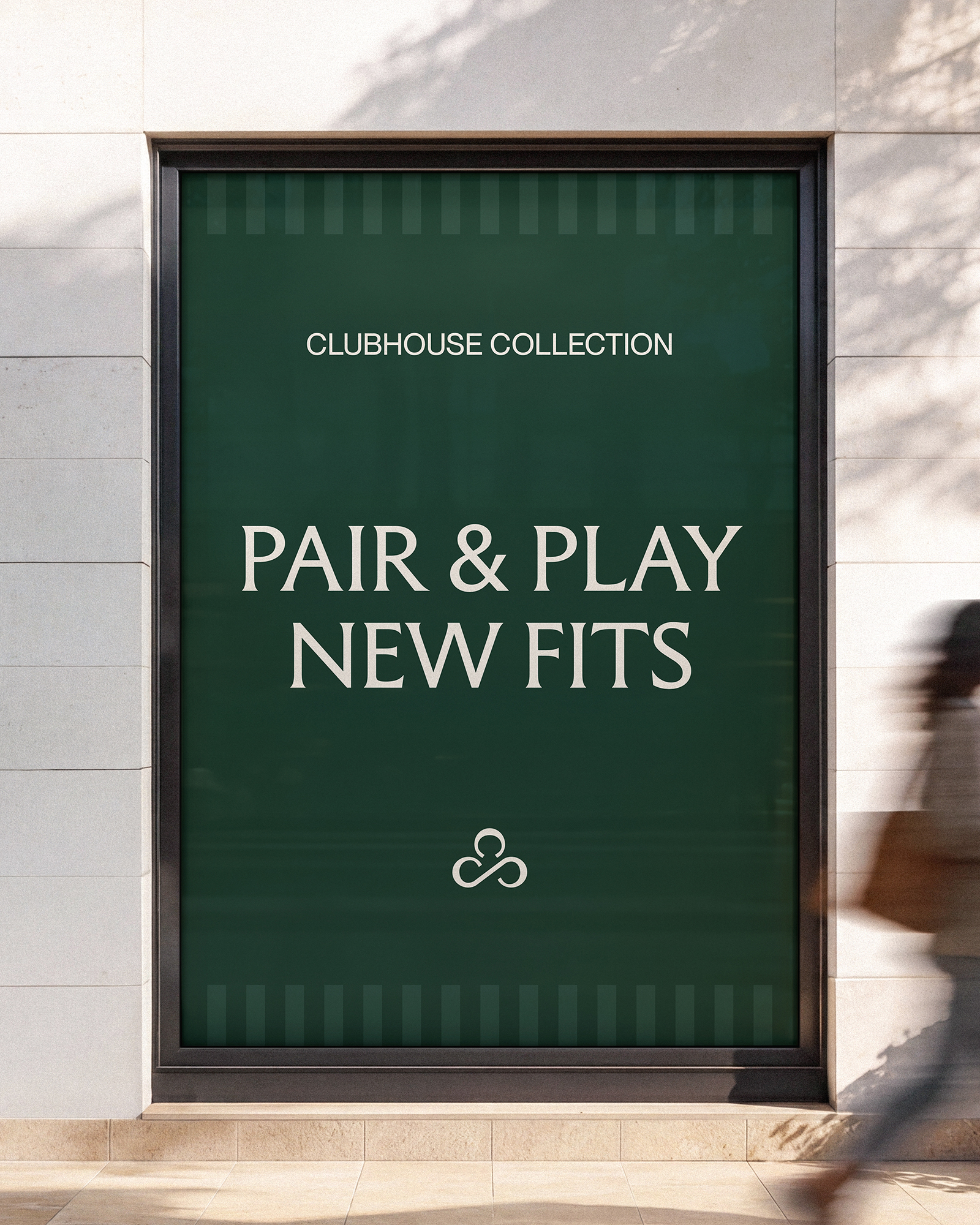
We translated Courtside’s balance of heritage and contemporary refinement into an elegant serif wordmark, fluid three-C monogram, and a visual system shaped by heritage green, warm neutrals, expressive typography, and signature patterns. The Courtside Check and Club Stripe introduce rhythm and recognition, while art direction connects the textures and silhouettes of the sport with the people and moments surrounding it.